ConvexBottomBar
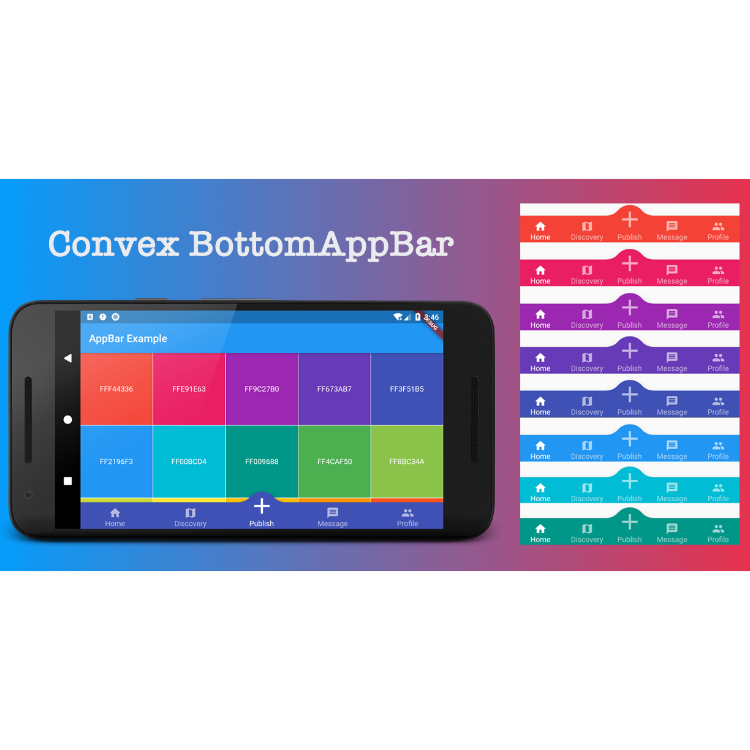
ConvexBottomBar是一个底部导航栏组件,用于展现凸起的TAB效果,支持多种内置样式与动画交互。


ConvexBottomBar是一个底部导航栏组件,用于展现凸起的TAB效果,支持多种内置样式与动画交互。你可以在https://appbar.codemagic.app上找到在线样例。
convex_bottom_bar 现在是一个 Flutter Favorite 插件库!

通常ConvexAppBar可以通过设置bottomNavigationBar与Scaffold一起使用。
ConvexAppBar具有两个构造函数,ConvexAppBar()将使用默认样式来简化选项卡的创建。
将此添加到您程序包的pubspec.yaml文件中,注意使用最新版本:
dependencies:
  convex_bottom_bar: ^latest_version
import 'package:convex_bottom_bar/convex_bottom_bar.dart';
Scaffold(
bottomNavigationBar: ConvexAppBar(
items: [
TabItem(icon: Icons.home, title: 'Home'),
TabItem(icon: Icons.map, title: 'Discovery'),
TabItem(icon: Icons.add, title: 'Add'),
TabItem(icon: Icons.message, title: 'Message'),
TabItem(icon: Icons.people, title: 'Profile'),
],
onTap: (int i) => print('click index=$i'),
)
);Flutter Version Support 由于Flutter迭代非常快。SDK本身有可能出现不兼容的API变更,我们将继续支持flutter稳定版本,非稳定的beta、dev channel 通过单独版本号进行兼容。
| Stable Flutter Version | Package Version | More |
|---|---|---|
| >=1.20 | >=2.4.0 | 从 v1.20开始, Stack组件的API发送不兼容变更 |
| <1.20 | <2.4.0 | v1.20稳定版发布后,我们对老版本如v1.17, v1.12 的支持将不再继续更新 |
如果你只需要一个单独的按钮,不妨试试 ConvexButton.
如果需要在TAB上添加徽章/角标,请使用 ConvexAppBar.badge来构建。
ConvexAppBar.badge({0: '99+', 1: Icons.assistant_photo, 2: Colors.redAccent},
  items: [
    TabItem(icon: Icons.home, title: 'Home'),
    TabItem(icon: Icons.map, title: 'Discovery'),
    TabItem(icon: Icons.add, title: 'Add'),
  ],
  onTap: (int i) => print('click index=$i'),
);badge()方法接受一个角标数组; 角标是带有选项卡项的映射,每个条目的值可以是String,IconData,Color或Widget。
Scaffold(
  appBar: AppBar(title: const Text('ConvexButton Example')),
  body: Center(child: Text('count $count')),
  bottomNavigationBar: ConvexButton.fab(
    onTap: () => setState(() => count++),
  ),
);AppBar默认使用内置样式,您可能需要为其设置主题。 以下是一些支持的属性:

| Attributes | Description |
|---|---|
| backgroundColor | AppBar 背景 |
| gradient | 渐变属性,可以覆盖backgroundColor |
| height | AppBar 高度 |
| color | icon/text 的颜色值 |
| activeColor | icon/text 的选中态颜色值 |
| curveSize | 凸形大小 |
| top | 凸形到AppBar上边缘的距离 |
| style | 支持的样式:fixed, fixedCircle, react, reactCircle, ... |
| chipBuilder | 角标构造器builder,ConvexAppBar.badge会使用默认样式 |
重载Tab内置样式。 该API与 ConvexAppBar.builder不同,为了满足您可能需要更新选项卡样式而不定义新的选项卡样式。
温馨提示:
则此Hook能力是有限的,如果您提供的尺寸与内部样式不匹配,并且可能导致 overflow broken。
StyleProvider(
  style: Style(),
  child: ConvexAppBar(
    initialActiveIndex: 1,
    height: 50,
    top: -30,
    curveSize: 100,
    style: TabStyle.fixedCircle,
    items: [
      TabItem(icon: Icons.link),
      TabItem(icon: Icons.import_contacts),
      TabItem(title: "2020", icon: Icons.work),
    ],
    backgroundColor: _tabBackgroundColor,
  ),
)
class Style extends StyleHook {
  @override
  double get activeIconSize => 40;

  @override
  double get activeIconMargin => 10;

  @override
  double get iconSize => 20;

  @override
  TextStyle textStyle(Color color) {
    return TextStyle(fontSize: 20, color: color);
  }
}RTL的内部适配,如果你配置了Directionality,将自动支持ltf和rtl两种布局风格。
Directionality(
  textDirection: TextDirection.rtl,
  child: Scaffold(body:ConvexAppBar(/*TODO ...*/)),
)如果默认样式与您的情况不符,请尝试使用 ConvexAppBar.builder(),它可以让您自定义几乎所有TAB样式。
Scaffold(
  bottomNavigationBar: ConvexAppBar.builder(
    count: 5,
    backgroundColor: Colors.blue,
    itemBuilder: Builder(),
  )
);

/*user defined class*/
class Builder extends DelegateBuilder {
  @override
  Widget build(BuildContext context, int index, bool active) {
    return Text('TAB $index');
  }
}完整的自定义示例可以在example中找到。
如您在使用过程中有新功能建议或者遇到问题,请移步至issue tracker提交。